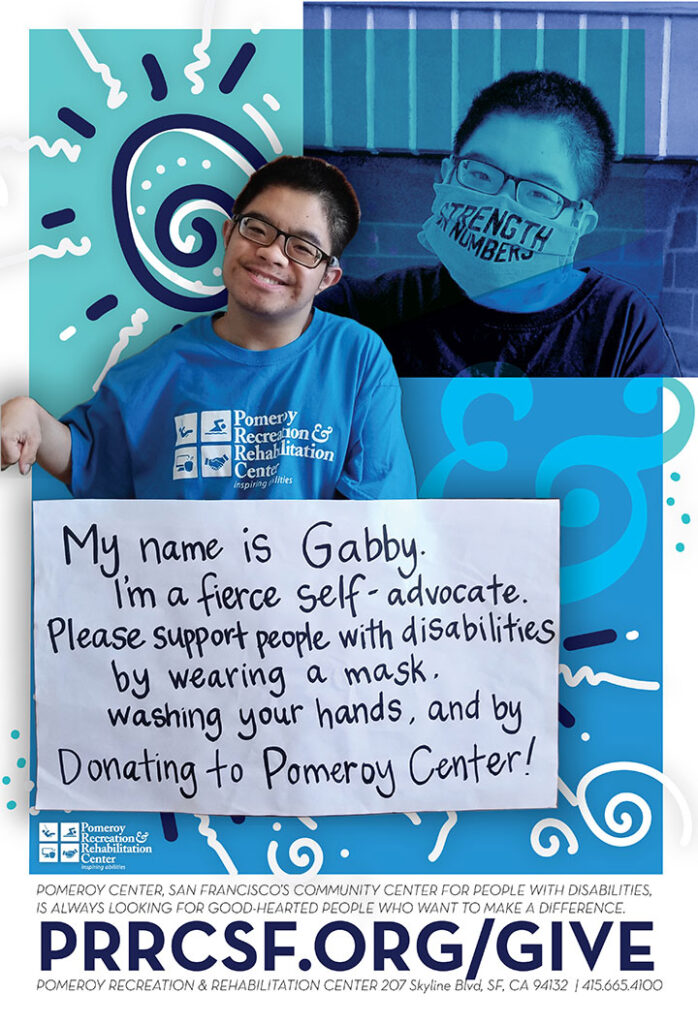
San Francisco’s Community Center for people with disabilities. These are some recent projects. The top is part of an 7′ tall 8-banner series that will be decorating our fences. The bottom piece is Gabby starring in the local mall kiosk ad, which is 6′ tall. Working with other people’s cell phone photos due to quarantine times, managed to make these work.
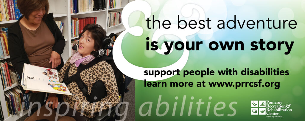
Pomeroy’s logo was subtle and a used an ampersand from another font meant to represent a person in a wheelchair. Influenced by our surroundings of ocean, lake, sky, and our indoor pool, I changed the logo colors to “Pomeroy Blues”. The natural ampersand of the font Adobe Caslon Pro is more elegant, and equally representative of the wheelchair concept. To me though, I see a person in profile, arms showing strength.